Introduction to Plotting with Matplotlib#
Watch a walk-through of this lesson on YouTube
Questions#
How can I plot my data?
How can I save my plot for publishing?
Learning Objectives#
Create a time series plot showing a single data set
Create a scatter plot showing relationship between two data sets
Use methods to plot directly from pandas DataFrames
Customize basic features of a plot, such as axis labels, titles, colors, and line styles

Matplotlib is, effectively, the core plotting and data visualization package in Python. Many other packages use Matplotlib for data visualization, including pandas, NumPy, and SciPy. Matplotlib is not the only visualization package in Python, by any means. There are many others, including seaborn, Altair, ggpy, Bokeh, and plot.ly. Some of the others are actually built on top of Matplotlib, but simply the syntax for creating specific, complex types of graphics relative to what’s required in Matplotlib (these are called wrappers for Matplotlib). Others are entirely independent. Regardless, Matplotlib is the most widely-used and flexible package for data visualization in Python, and so it’s valuable to learn it first, and then build out your skills from there.
Matplotlib is also a very mature Python package, having been first released in 2003 and continuously updated since then. It has a strong development community, a detailed website with extensive documentation and many examples, and there is copious third party documentation in the form of blog posts, books, and more — much of which is freely available.
History#
Matplotlib’s original developer, John D. Hunter (1968-2012), was a neuroscience PhD student who needed to plot electrocorticography (ECoG) data (electrical data recorded directly from the surface of the brain). Hunter originally designed Matplotlib to emulate the plotting abilities of Matlab, but in Python. Matlab is a commercial programming language and environment, designed for — and widely used by — engineers and scientists. Hunter encountered limitations in Matlab that he wanted to work around. Because Matlab is a commercial product, rather than an open source one, development is controlled by a company (Mathworks). Although developers can write quite extensive and complex applications in Matlab, they are ultimately limited by the decisions that its developers have made. Hunter decided to switch his work to use Python, and wanted to develop a plotting interface that was similar to that used in Matlab. Indeed, this is where the “Mat” part of the name Matplotlib came from.
Importing Matplotlib#
We have previously covered how to import a Python package using the import command. We also covered how to import a package with an alias, using the syntax import [pacakge] as [alias]
For Matplotlib, we will do this again, but we add an extra detail: Matplotlib, like many Python packages, is organized into a number of “modules” (essentially subsets of functions). The one that you will typically want to import for plotting is called pyplot. So we use the syntax below:
import matplotlib.pyplot as plt
import matplotlib.pyplot as plt
Generating a Plot#
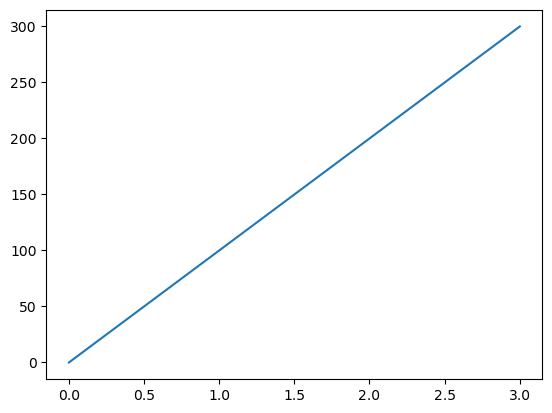
Now we can draw a simple line plot using the matplotlib.pyplot’s plot() function, by creating two lists of data points (each 4 elements long), which represent time elapsed and distance traveled by some hypothetical object:
time = [0, 1, 2, 3]
position = [0, 100, 200, 300]

plt.plot(time, position)
time = [0, 1, 2, 3]
position = [0, 100, 200, 300]

plt.plot(time, position)
[<matplotlib.lines.Line2D at 0x1142a5090>]
You can see above that we used the Matplotlib alias plt followed by the name of a specific function in the package, plot(). This is the same syntax as when we used a pandas function, such as pd.read_csv().
Another thing to note is that above the plot is some text, something like: [<matplotlib.lines.Line2D at 0x7f72bc26ce20>]. This is part of the output of the plt.plot() command, but typically not something that we care to see. We can generate the plot without this extra output, by including the command plt.show() at the end of the cell. Recall that Jupyter only shows the output of the last output-generating command in a cell, and plt.show() shows the plot without the extra text. It’s good to make a habit of putting plt.plot() as the last line of code in any Jupyter cell you generate a plot in.
# since we defined time and position above, no need to re-assign them here
plt.plot(time, position)
plt.show()
# since we defined time and position above, no need to re-assign them here
plt.plot(time, position)
plt.show()
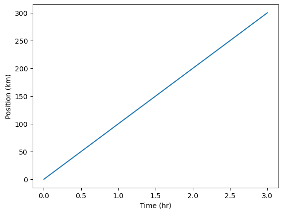
Labelling Axes#
Matplotlib also allows us to modify the plot in many ways, which can improve the interpretability of a plot. For example, it’s always good practice to label the axes of a plot.
In most cases, the way we modify or enhance a Matplotlib plot are not by adding arguments to the .plot() command, but executing additional commands after .plot() that modify what was created by .plot(), culminating in the plt.show() command for the “final reveal”:
plt.plot(time, position)
plt.xlabel('Time (hr)')
plt.ylabel('Position (km)')
plt.show()
plt.plot(time, position)
plt.xlabel('Time (hr)')
plt.ylabel('Position (km)')
plt.show()
Plotting pandas DataFrames#
pandas is integrated with Matplotlib, making it easy to generate plots of data stored in pandas DataFrames. Methods are defined for pandas DataFrames that generate plots using Matplotlib.
Import Data as a pandas DataFrame#
Let’s try this by first importing pandas and loading in the Gapminder Oceania data (data/gapminder_gdp_oceania.csv):
import pandas as pd
df = pd.read_csv('data/gapminder_gdp_oceania.csv', index_col='country')
import pandas as pd
df = pd.read_csv('data/gapminder_gdp_oceania.csv', index_col='country')
Let’s see what this DataFrame looks like:
df
df
| gdpPercap_1952 | gdpPercap_1957 | gdpPercap_1962 | gdpPercap_1967 | gdpPercap_1972 | gdpPercap_1977 | gdpPercap_1982 | gdpPercap_1987 | gdpPercap_1992 | gdpPercap_1997 | gdpPercap_2002 | gdpPercap_2007 | |
|---|---|---|---|---|---|---|---|---|---|---|---|---|
| country | ||||||||||||
| Australia | 10039.59564 | 10949.64959 | 12217.22686 | 14526.12465 | 16788.62948 | 18334.19751 | 19477.00928 | 21888.88903 | 23424.76683 | 26997.93657 | 30687.75473 | 34435.36744 |
| New Zealand | 10556.57566 | 12247.39532 | 13175.67800 | 14463.91893 | 16046.03728 | 16233.71770 | 17632.41040 | 19007.19129 | 18363.32494 | 21050.41377 | 23189.80135 | 25185.00911 |
There are only two countries in this data set, which makes it easy to work with.
Plotting directly from a pandas DataFrame#
Our goal is to plot the GDP for a particular country (or countries), as a function of year. In other words, we want to plot a line for each country, with year on the x axisa and GDP on the y axis.
Let’s run the pandas .plot() method on our DataFrame to generate a Matplotlib plot:
df.plot()
plt.show()
df.plot()
plt.show()
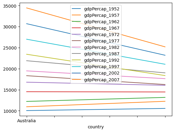
We get a plot all right, but it’s not the most intuitive way to look at the data. What happened here?
We can see from the legend that Python generated a line for each year in the data set, with country on the x axis. This is because by default, Matplotlib will use the rows of a DataFrame as the x axis, and use columns to define the groupings that define individual lines. But in our DataFrame, the rows (indexes) are the countries.
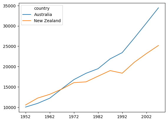
We can change this by transposing the DataFrame, an operation which swaps the rows and columns (rows become columns, and vice-versa). To transpose the DataFrame we us the .T operator (note that .T is an operator, not a method, so you shouldn’t add parentheses after the T)
df.T.plot()
plt.show()
df.T.plot()
plt.show()
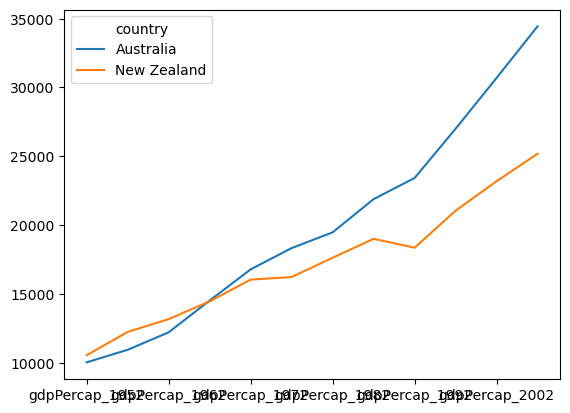
You can see above that pandas + Matplotlib also recognizes the index of the DataFrame as labels, so a legend is automatically generated with the country names.
Another important point to note is that we applied .T “on the fly” in generating the plot. That is, we didn’t modify the DataFrame df stored in memory. We just passed the data from df through the .T operator when we generated the plot. You can see that df is not transposed by viewing it again:
df
df
| gdpPercap_1952 | gdpPercap_1957 | gdpPercap_1962 | gdpPercap_1967 | gdpPercap_1972 | gdpPercap_1977 | gdpPercap_1982 | gdpPercap_1987 | gdpPercap_1992 | gdpPercap_1997 | gdpPercap_2002 | gdpPercap_2007 | |
|---|---|---|---|---|---|---|---|---|---|---|---|---|
| country | ||||||||||||
| Australia | 10039.59564 | 10949.64959 | 12217.22686 | 14526.12465 | 16788.62948 | 18334.19751 | 19477.00928 | 21888.88903 | 23424.76683 | 26997.93657 | 30687.75473 | 34435.36744 |
| New Zealand | 10556.57566 | 12247.39532 | 13175.67800 | 14463.91893 | 16046.03728 | 16233.71770 | 17632.41040 | 19007.19129 | 18363.32494 | 21050.41377 | 23189.80135 | 25185.00911 |
Renaming Columns#
The x axis labels in the above plot are hard to read, because each column name contains not only the year, but the preceding text gdpPercap_, e.g., gdpPercap_1972. It would be nice to remove this leading text so column labels are just the numerical years.
Fortunately, pandas has a .str.strip() method, which removes from the string the characters stated in the argument. This method works on strings, which is why we call str before .strip(). To rename the columns, we can rely on the fact that pandas DataFrames have a .columns property that allows us to refer to the entire set of column labels.
df.columns = df.columns.str.strip('gdpPercap_')
df
df.columns = df.columns.str.strip('gdpPercap_')
df
| 1952 | 1957 | 1962 | 1967 | 1972 | 1977 | 1982 | 1987 | 1992 | 1997 | 2002 | 2007 | |
|---|---|---|---|---|---|---|---|---|---|---|---|---|
| country | ||||||||||||
| Australia | 10039.59564 | 10949.64959 | 12217.22686 | 14526.12465 | 16788.62948 | 18334.19751 | 19477.00928 | 21888.88903 | 23424.76683 | 26997.93657 | 30687.75473 | 34435.36744 |
| New Zealand | 10556.57566 | 12247.39532 | 13175.67800 | 14463.91893 | 16046.03728 | 16233.71770 | 17632.41040 | 19007.19129 | 18363.32494 | 21050.41377 | 23189.80135 | 25185.00911 |
Now if we plot df again, the x axis labels are clearer:
df.T.plot()
plt.show()
df.T.plot()
plt.show()
Look at the DataFrame now, to see the result:
df
df
| 1952 | 1957 | 1962 | 1967 | 1972 | 1977 | 1982 | 1987 | 1992 | 1997 | 2002 | 2007 | |
|---|---|---|---|---|---|---|---|---|---|---|---|---|
| country | ||||||||||||
| Australia | 10039.59564 | 10949.64959 | 12217.22686 | 14526.12465 | 16788.62948 | 18334.19751 | 19477.00928 | 21888.88903 | 23424.76683 | 26997.93657 | 30687.75473 | 34435.36744 |
| New Zealand | 10556.57566 | 12247.39532 | 13175.67800 | 14463.91893 | 16046.03728 | 16233.71770 | 17632.41040 | 19007.19129 | 18363.32494 | 21050.41377 | 23189.80135 | 25185.00911 |
Customizing Plot Appearance#
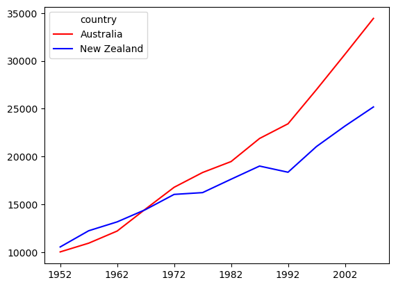
If we want to customize the colors of a plot with multiple categories (lines, bars, etc), we can pass a keyword argument (kwarg) to the .plot() method.
To change line colors, we pass the kwarg color= followed by a list of color names, with the number of list items equal to the number of categories we’re plotting (in this case, two):
df.T.plot(color=['red', 'blue'])
plt.show()
Attention
color= is a particular kind of argument to a function, called a keyword argument (kwarg). Recall that arguments are information provided to a function that alter how it runs. kwargs are arguments that use a keyword (in this case, color), followed by the = sign, followed by a value to pass to the argument. kwargs are commonly used for optional arguments. A Python function that takes multiple arguments needs to know how to interpret each argument. Mandatory arguments typically are required to be listed in a particular order, which allows the function to know how to interpret each one. However, optional arguments might not occur, so order would not be a good way of determining the meaning of the argument. The keywords allow the function to know how to interpret each kwarg.
df.T.plot(color=['red', 'blue'])
plt.show()
Selecting subsets of a DataFrame#
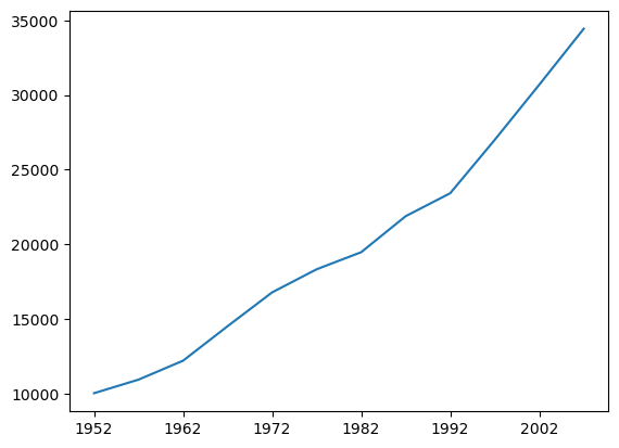
Above we selected only the data from Australia using .loc[], and assigned that to gdp_australia. But more efficiently, using the pandas .plot() method, we can chain together the .loc[] selector and the .plot() method to select the relevant data ‘on the fly’ rather than first defining a variable to hold that data.
For example we can plot the data for a specific country (Australia), by selecting it using the .loc[] method to select the index Australia:
df.loc['Australia'].plot()
plt.show()
df.loc['Australia'].plot()
plt.show()
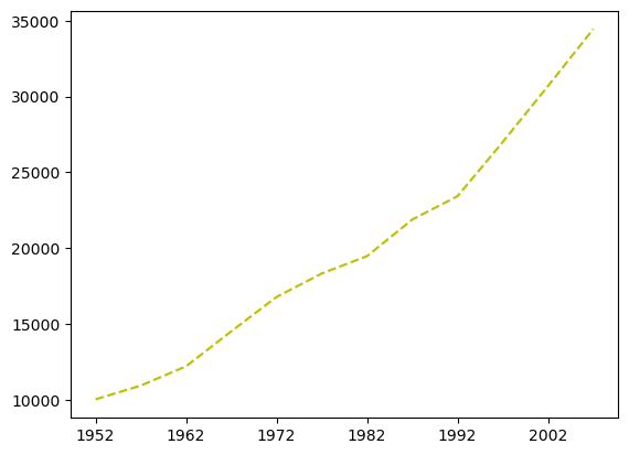
We can customize this using the color and linestyle kwargs. Note that if we’re only passing a single value to a kwarg, we don’t use a list:
df.loc['Australia'].plot(color='y', linestyle='--')
plt.show()
df.loc['Australia'].plot(color='y', linestyle='--')
plt.show()
Types of plots#
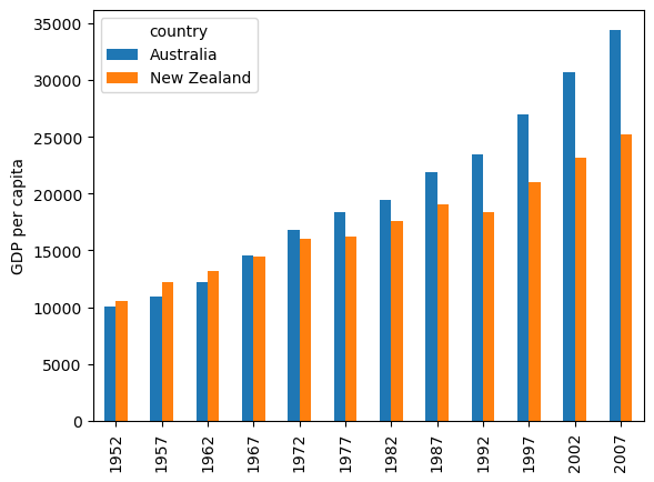
Matplotlib will make some assumptions about how to plot your , based on the types of values it is given. However, you can override these defaults by specifying the type of plot you desire. For example, we can plot the same Gapminder data as bars, by using the keyword argument kind='bar':
df.T.plot(kind='bar')
plt.ylabel('GDP per capita')
plt.show()
df.T.plot(kind='bar')
plt.ylabel('GDP per capita')
plt.show()
Something to get used to is that some plot styles can be defined as keyword arguments to .plot(), as above, others can be generated using subfunctions of .plot, such as .plot.scatter(), as below. Often, you can use either one to get the same result. It’s often the case in Python that there are many different ways to do the same thing!
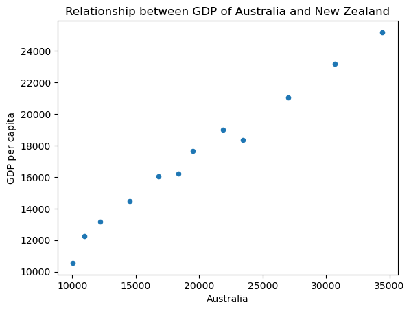
Scatterplots#
Since Australia and New Zealand are in the same region of the world, and engage in a lot of trade with each other, it’s likely that their GDPs are correlated with each other. That is, as Australia’s GDP goes up, we would expect New Zealand’s to go up similarly.
Below we generate a scatterplot to examine whether the two Oceania countries’ GDPs correlate. This requires a different type of data selection from the plots above, because here we want to use the data from one row as the x axis, and another row as the y axis — rather than using rows for groups and columns for the x axis. Fortunately, the pandas .plot.scatter() method recognizes our row names (indexes) so we just have to specify their names:
df.T.plot.scatter(x='Australia', y='New Zealand')
plt.ylabel('GDP per capita')
plt.title('Relationship between GDP of Australia and New Zealand')
plt.show()
df.T.plot.scatter(x='Australia', y='New Zealand')
plt.ylabel('GDP per capita')
plt.title('Relationship between GDP of Australia and New Zealand')
plt.show()
Exercises#
The Expanding Wealth Gap#
Fill in the blanks below to plot the minimum GDP per capita over time for all the countries in Europe. Modify it again to plot the maximum GDP per capita over time for Europe.
data_europe = pd.read_csv('data/gapminder_gdp_europe.csv', index_col='country')
data_europe.___.plot(label='min') # Method to find the minimum value
data_europe.___.plot(label='max') # Method to find the maximum value
plt.legend(loc='best')
plt.xticks(rotation=90)
plt.___() # Show plot
Click the button to reveal the solution
data_europe = pd.read_csv('data/gapminder_gdp_europe.csv', index_col='country')
data_europe.min().plot(label='min')
data_europe.max().plot(label='max')
plt.legend(loc='best')
plt.xticks(rotation=90)
plt.show()
You might note that the variability in the maximum is much higher than that of the minimum. Take a look at the maximum and the max indexes:
data_asia = pd.read_csv('data/gapminder_gdp_asia.csv', index_col='country')
data_asia.max().plot()
plt.show()
print(data_asia.idxmax())
print(data_asia.idxmin())
More Correlations#
This short program creates a plot showing the correlation between GDP and life expectancy for 2007, normalizing marker size by population:
data_all = pd.read_csv('data/gapminder_all.csv', index_col='country')
data_all.plot(kind='scatter',
              x='gdpPercap_2007',
              y='lifeExp_2007',
              s=data_all['pop_2007'] / 1e6
             )
plt.show()
Using online help and other resources, explain what each argument to plot() does.
Saving your plot to a file#
If you are satisfied with the plot you see you may want to save it to a file, perhaps to include it in a publication. There is a function in the matplotlib.pyplot module that accomplishes this: .savefig(). Calling this function, e.g. with
plt.savefig('my_figure.png')
will save the current figure to the file my_figure.png. The file format will automatically be deduced from the file name extension (other formats are pdf, ps, eps and svg).
Note that, when we’re using the functional approach to Matplotlib, functions in plt refer to a global figure variable and after a figure has been displayed to the screen (e.g. with plt.show()) Matplotlib will make this variable refer to a new empty figure. Therefore, make sure you call plt.savefig() before the plot is displayed to the screen, otherwise you may find a file with an empty plot.
df.T.plot(kind='bar')
plt.savefig('my_figure.png')
plt.show()
Summary of Key Points#
Matplotlib is the most widely used scientific plotting library in Python.
Methods allow you to plot data directly from a pandas dataframe.
It is common to need to select and transform data, then plot it.
Many styles of plot are available: see the Python Graph Gallery for more options.
It’s possible to plot many sets of data together
This lesson is adapted from the Software Carpentry Plotting and Programming in Python workshop.